apply a crafty style to the lane buttons #273
No Assignees
Notifications
Due Date
No due date set.
Dependencies
No dependencies set.
Reference: HPR/hpr_generator#273
Reference in New Issue
Block a user
Delete Branch "lee/hpr_generator:newsite"
Deleting a branch is permanent. Although the deleted branch may continue to exist for a short time before it actually gets removed, it CANNOT be undone in most cases. Continue?
Apply a crafty style to lane buttons
Merged in changes
The buttons are looking good. My only concern is from an accessibility point of view.
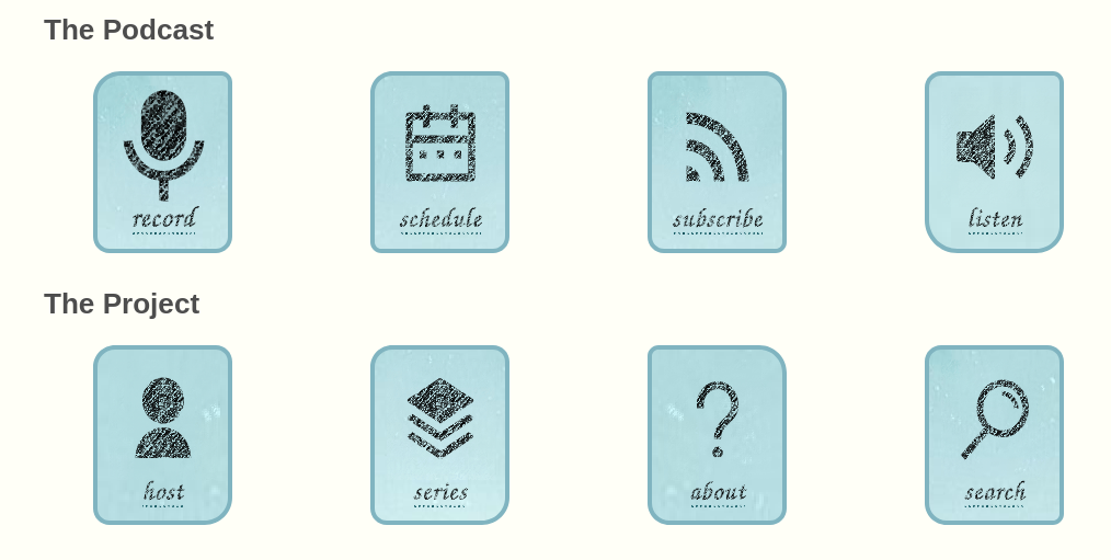
On my screen, the contrast between the text and the background feels too low. I think part of this is due to the combination of that particular font and the pixelation effect being applied.
Slightly nit picky and along the same issue as above, the record icon looks like it has more contrast. Probably because there is more black overall. Is there a way to give the other icons the same "weight" as the record icon?
Hmm, something is up with the font rendering on the screenshot, it should be using a specific google font, it looks like it is using the fallback generic cursive font, better maybe to fallback to sans. The record icon is deliberately more pronounced - as Ken keeps saying, more than anything else the purpose of the website is to encourage people to record. But if that level of contrast works better. then the others, can be made similar. Again the backgrounds are deliberately trying to show some pixels and are mixed up a bit as to which part of the background image each one shows, both for variation and to try to give a rough work in progress feel. Maybe best just to standardise and reduce that complexity as it adds a lot of css with little payback.
I'll aim to revise and re-submit based on the feedback.
Also keep in mind the license of any font we need to have that listed on the page. Also all fonts need to be hosted on the deployed site, and not from 3rd party services like Google.
Ahh, didn't realize the font wasn't correct. I just cloned your repository and then generated the index page. Should have looked closer at your snip above.
Ok, Fair point on highlighting that record icon. Maybe make the others a little closer to it, and then make the border for the record icon the --background-secondary color--so that it is emphasized by the border.
lol, or we could add a blink tag or the modern CSS equivalent to that icon. Really draw attention to it 😛
Amended now, that font licence along with the font is at /public_html/css/patrickhand/OFL.txt
Not sure where the underline under the link has gone, though I'm on a Mac now was on Linux earlier
Noir on the Mac is not kind to this though, but that's maybe a wider issue to do with dark mode, etc.
I love the blink tag idea, how 1990s would that be 🙂
Wait I'm going to redo that commit because the diff looks to have reverted other changes, which would explain a few things
f55f24957ato4654adaa42Okay, re-committed now
Thanks for this Lee. I have merged into the hpr/newsite branch.