Table of Contents
HPR Website Design
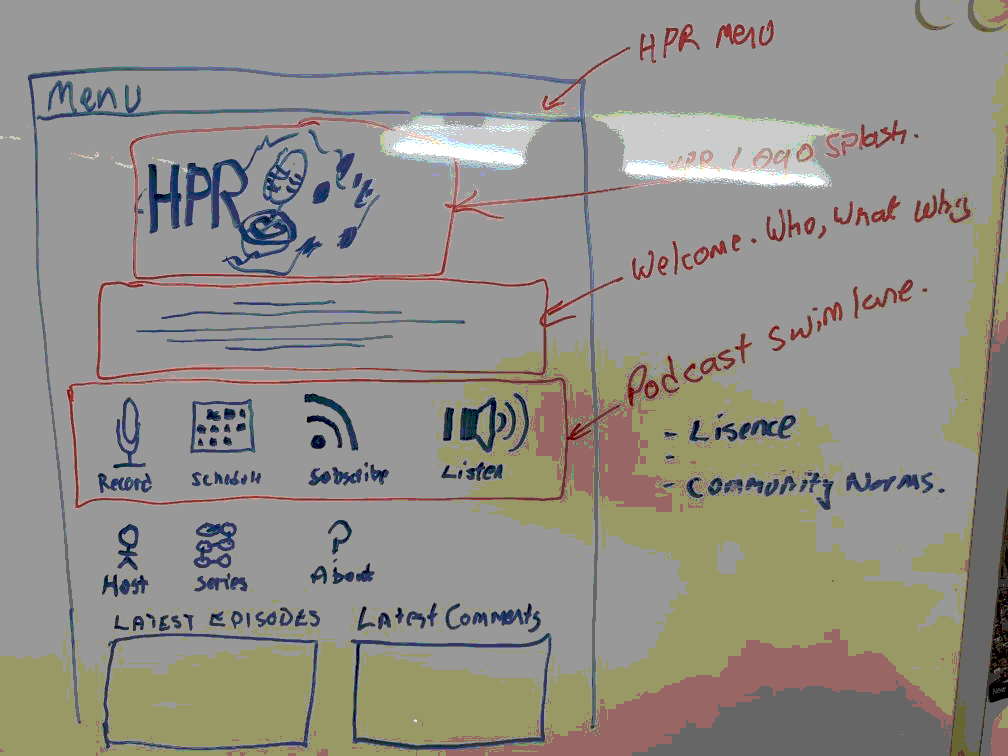
This is literally in the whiteboard phase - thoughts and suggestions please. Focus on big hitters when you get to the site.
Inspired by LibreOffice template CC by SA, Risyad Rais
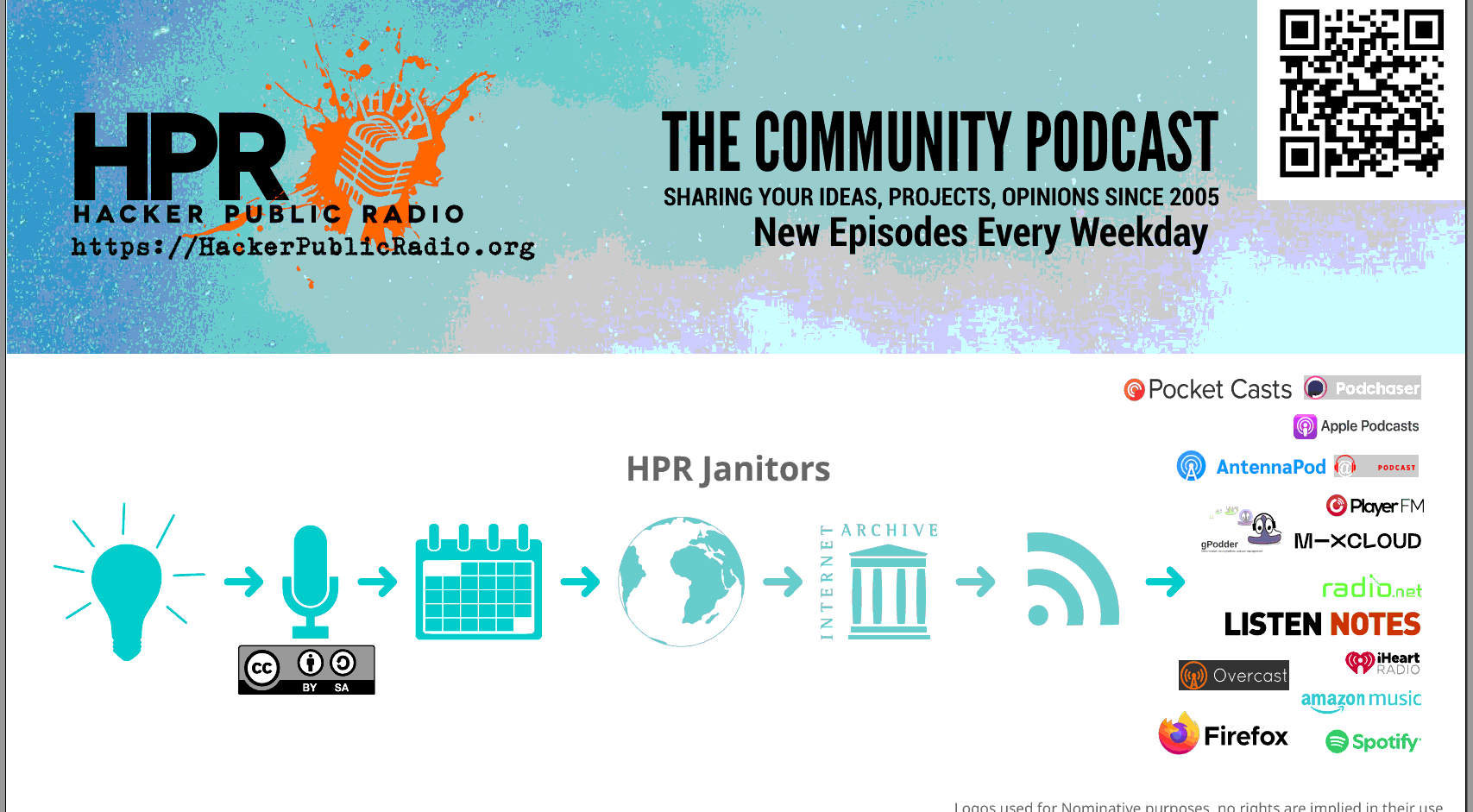
Logo Banner
Should summaries the project in one glance.
Top is the HPR splash logo with the text "The community podcast", and "Sharing your ideas, projects and opinions since 2005"
We will maintain the tradition that the letters point to:
- H → https://hackerpublicradio.org/correspondents/index.html
- P → https://hackerpublicradio.org/comments_viewer.html
- R → https://hackerpublicradio.org/syndication.html
Welcome
The who, where, what, and why in short punchy text. A block of text, like "Hacker Public Radio is a podcast that releases shows every weekday Monday to Friday. The shows are contributed by the public and can be on any topic that are of interest to hackers, makers, hobbyists, etc. " etc
Logo Grid
Then two rows of the "go to" pieces of information that answers "I have come to HPR Site looking for $X" I think "Hosts", "Series", "Subscribe", "Listen", - your help here would be great. Then just a one line summary of the last 10 episodes, and the last 10 comments.
Future Changes
Dark Mode
It's good to keep this in mind, but it will come after the design is done.

